The Mystery of the "Perfect" Grey
We have all been there. You spend hours scrolling through Pinterest or Instagram. You find a photo of a stunning, airy living room painted a chic, modern grey. It looks warm, inviting, and sophisticated. You find the exact colour name, rush to the store to buy a gallon, and paint your living room on a Saturday afternoon.
But by Sunday morning, as the weak winter sun drifts through the window, that "chic grey" doesn’t look warm or inviting. It looks cold. It looks flat. In the corners, it might even look a little purple or like unmixed concrete.
You didn’t make a mistake in your painting technique. You didn’t buy a bad batch of paint. You are simply dealing with a phenomenon that interior designers in California or Texas rarely have to worry about.
You are dealing with The Northern Light.
At Cloverdale Paint, we have been manufacturing paint in Western Canada since 1933. We know a thing or two about the Canadian climate. We know about the rain, the snow, and the freeze-thaw cycles that test our exterior stains. But we also know about the light.
Living in the Northern Hemisphere—whether you are in a condo in downtown Toronto, a heritage home in Winnipeg, or a rancher in the Fraser Valley—changes the way colour behaves. The light here is unique. It is cooler, bluer, and for many months of the year, it is lower in the sky.
If you are frustrated that your paint colours never look like the photos in magazines, this guide is for you. We are going to put on our "Designer Hats," strip away the complicated jargon, and teach you how to master the Northern Light to make your home feel cozy, even in the middle of February.
The Science of Canadian Light (Simpler Than You Think)
To pick the right colour, you have to understand the light source.
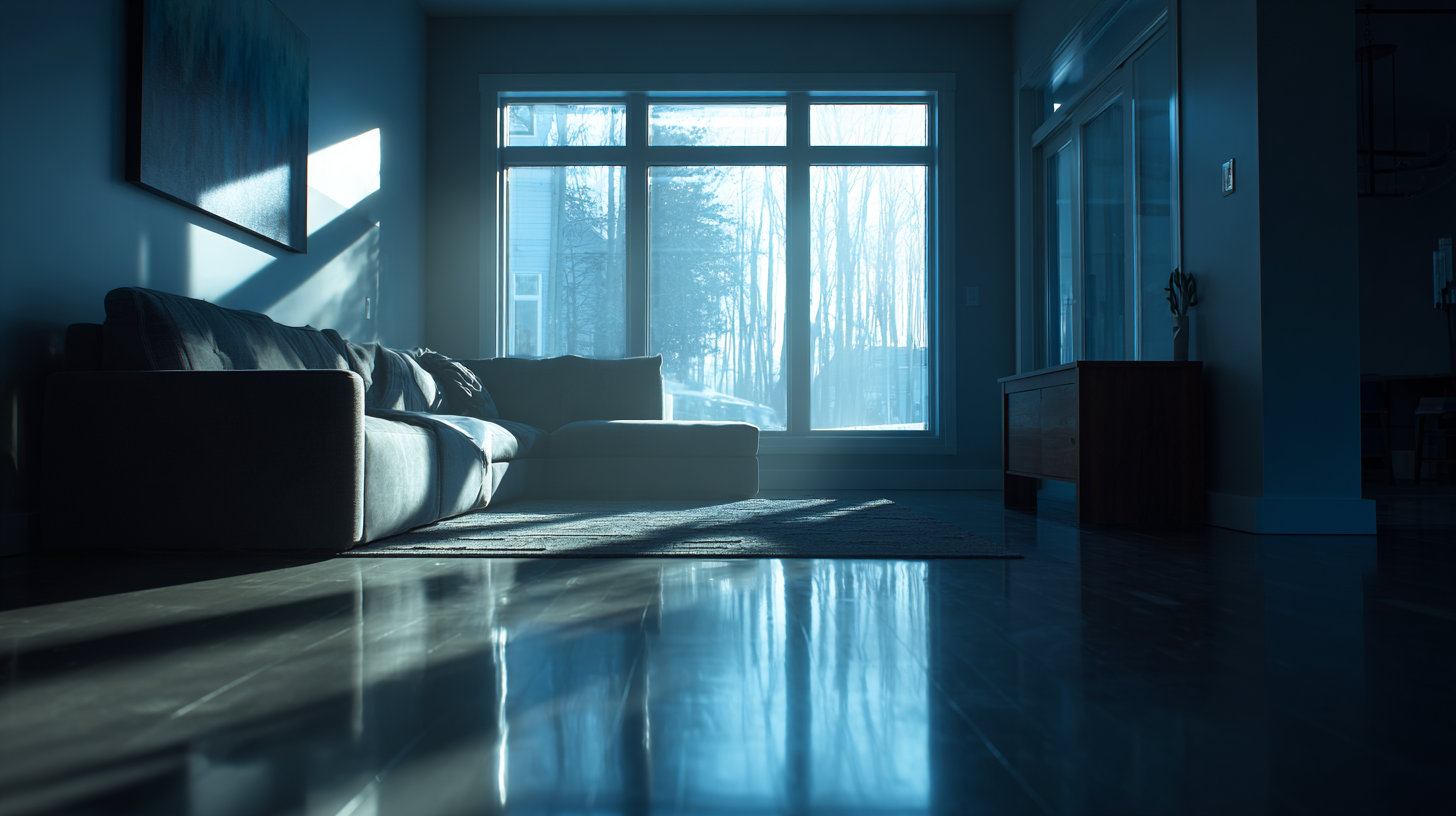
In Canada, because we are situated far north of the equator, the sun doesn't beat down on us from directly overhead for most of the year. Instead, it hits us at an angle from the south. This angle does two critical things to the natural light entering your home:
- It filters the spectrum: As sunlight travels through more atmosphere to reach us (due to the low angle), the light waves scatter. By the time the light enters your north-facing window, it is indirect and leans heavily into the blue and grey end of the spectrum.
- It creates shadows: The lower sun casts longer shadows. This means the corners of your rooms are often darker than rooms in homes closer to the equator.
Think of it like a camera filter.
Imagine you took a photo of a beige wall. Now, imagine putting a sheer blue filter over that photo. What happens to the beige? It turns slightly green or muddy. If you put that same blue filter over a crisp white wall, the white turns cold and clinical.
This is what Canadian daylight does to paint. It acts as a "Cool Filter."
If you pick a paint colour that is already cool (like a blue-grey or a stark white), the Canadian light will amplify that coolness, making the room feel chilly. To counter this, we need to look at Undertones.
The Secret Weapon: Understanding Undertones
When you look at a paint chip, you generally see the "Masstone." That’s the main colour—Blue, Red, Grey, Green.
But hiding underneath that main colour is the Undertone. This is the subtle influence of other colours mixed in.
- A grey can have a blue undertone (Cool).
- A grey can have a green undertone (Cool/Neutral).
- A grey can have a violet undertone (Cool).
- A grey can have a yellow or beige undertone (Warm).
The Golden Rule for Canadian Homes:
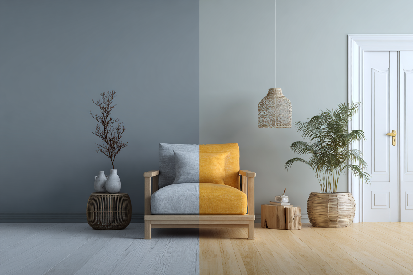
Because our natural light is generally cool (blue-leaning), you usually want to choose colours with warm undertones to balance it out.
If you put a cool grey in a room with cool light, the room feels dead.
If you put a warm grey (a "Greige") in a room with cool light, the warmth of the paint neutralizes the coolness of the light, and the result is a perfectly balanced, cozy grey.
This is where many DIYers get tripped up. They buy a "True Grey" because they want that modern look. But in Canada, a "True Grey" almost always reads as blue on the wall. To get the look of a "True Grey" in our light, you actually need to buy a grey that looks slightly beige on the chip.
The "White Paint" Trap
The biggest trend in the last decade has been the "Gallery White" look. Bright white walls, white trim, minimalist vibes. It looks incredible in photos taken in Australia or California, where the sun is bright and warm.
In Canada, painting a room stark white can be risky.
White paint relies on reflecting light. If the light coming in your window is grey and gloomy (hello, November!), the white wall will reflect that gloom. A stark white room in Vancouver or Halifax during winter can feel like the inside of a refrigerator.
How to do White right in Canada:
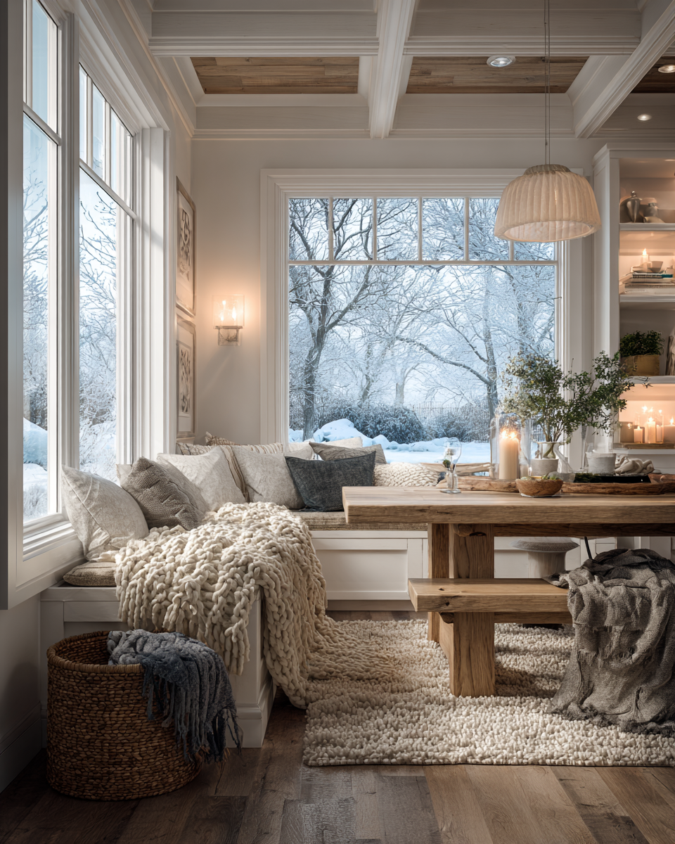
You don't have to abandon the white trend! You just need to shift your selection.
Instead of a stark, blue-white (often called "High Hide White" or generic base white), look for Off-Whites or Creamy Whites like Candle CA007 or Antique White EX288.
Look for whites that have a tiny drop of yellow or red pigment in them. You won't see the yellow on the wall; your eye will just read it as "White." But that tiny drop of pigment adds a "candlelight" effect that counteracts the grey weather outside.
Cloverdale Tip: When you are at the counter, ask to see the formula or ask the staff: "Does this white have any umber or ochre in it?" Those are the earth tones that bring the warmth we need.
A Room-by-Room Orientation Guide
Not every room in your house faces North. The direction your windows face (the orientation) dictates the light quality. Here is how to handle each one using the Cloverdale palette philosophy.
1. North-Facing Rooms (The Challenge)
These rooms never get direct sunlight. The light is consistent, but it is shadowless and cool.
- The Mistake: Painting it blue, green, or stark white. These colours will look dreary.
- The Fix: You need heat. Embrace warmer colours. If you want a neutral, go for a deep "Greige" (Grey-Beige) or a warm oatmeal colour. If you want colour, go for rich, saturated tones like terracotta, warm olive, or chocolate. Darker colours often work better in North-facing rooms because they embrace the coziness rather than trying to fight the lack of light.
2. South-Facing Rooms (The Lucky Ones)
These rooms get strong, direct light for most of the day. This light is warm and yellow.
- The Freedom: You can get away with almost anything here.
- The Strategy: Because the light is already warm (yellowish), you can actually use those cool blues and "True Greys" here. The warm sun will warm them up naturally. If you use a very warm colour (like a buttery yellow) in a south-facing room, it might feel a bit intense or "hot" in the summer.
- Designer Tip: This is the best place to use those "Cool Whites" or icy pastels you’ve been dreaming of, like Dove's Wing 0537, Warm Grey CA091, or Cashew EX118.
3. East-Facing Rooms (The Morning Glory)
These rooms get bright, warm light in the morning (sunrise) but turn cooler and shadowy in the afternoon and evening.
- The Considerations: When do you use the room? If it’s a bedroom, you’ll wake up to warm light. If it’s a living room you use after work, it will be cool.
- The Fix: Greens and Blues with a hint of warmth (like a teal or a sage) look beautiful here. They look fresh in the morning light and retain their character in the cool afternoon. Our picks are: Blue Jay CA202, Blue Depths 0628, and Dark Navy EX162
4. West-Facing Rooms (The Sunset Watchers)
The opposite of East. These are shadowy in the morning but get hit with intense, hot, orange light at sunset.
- The Considerations: The late-day sun can be glaring. It turns orange/red.
- The Fix: Be careful with red or orange paint here—it will look overwhelmingly intense at 5:00 PM. Cooler neutrals work well here to tone down the heat of the sunset, creating a relaxing vibe for the evening. Some colours for you to choose from: Ground Sage EX031, Sagebrush CA153, Everlasting Sage 0422
Don't Forget Artificial Light (Because it can get Dark at 4:30 PM)
Let’s be honest. For a big chunk of the year, we aren't seeing our walls in natural sunlight at all. We are seeing them under lightbulbs.
You can pick the perfect paint colour, but if you have the wrong lightbulbs, it will look terrible.
Lightbulbs are measured in Kelvins (K).
- 5000K (Daylight): This is very blue and bright. It mimics high-noon sun. In a home, this often feels like a hospital or a garage. It will make your warm paint colours look flat, and your cool colours look clinical. Avoid this for living spaces.
- 3000K - 3500K (Soft White): This is the sweet spot for modern homes. It is white but friendly. It renders colour accurately without casting a heavy yellow or blue tint.
- 2700K (Warm White): This mimics old incandescent bulbs. It is very yellow/orange. It makes rooms feel cozy, but it will change your paint colour. A light blue wall under 2700K light might turn slightly green.
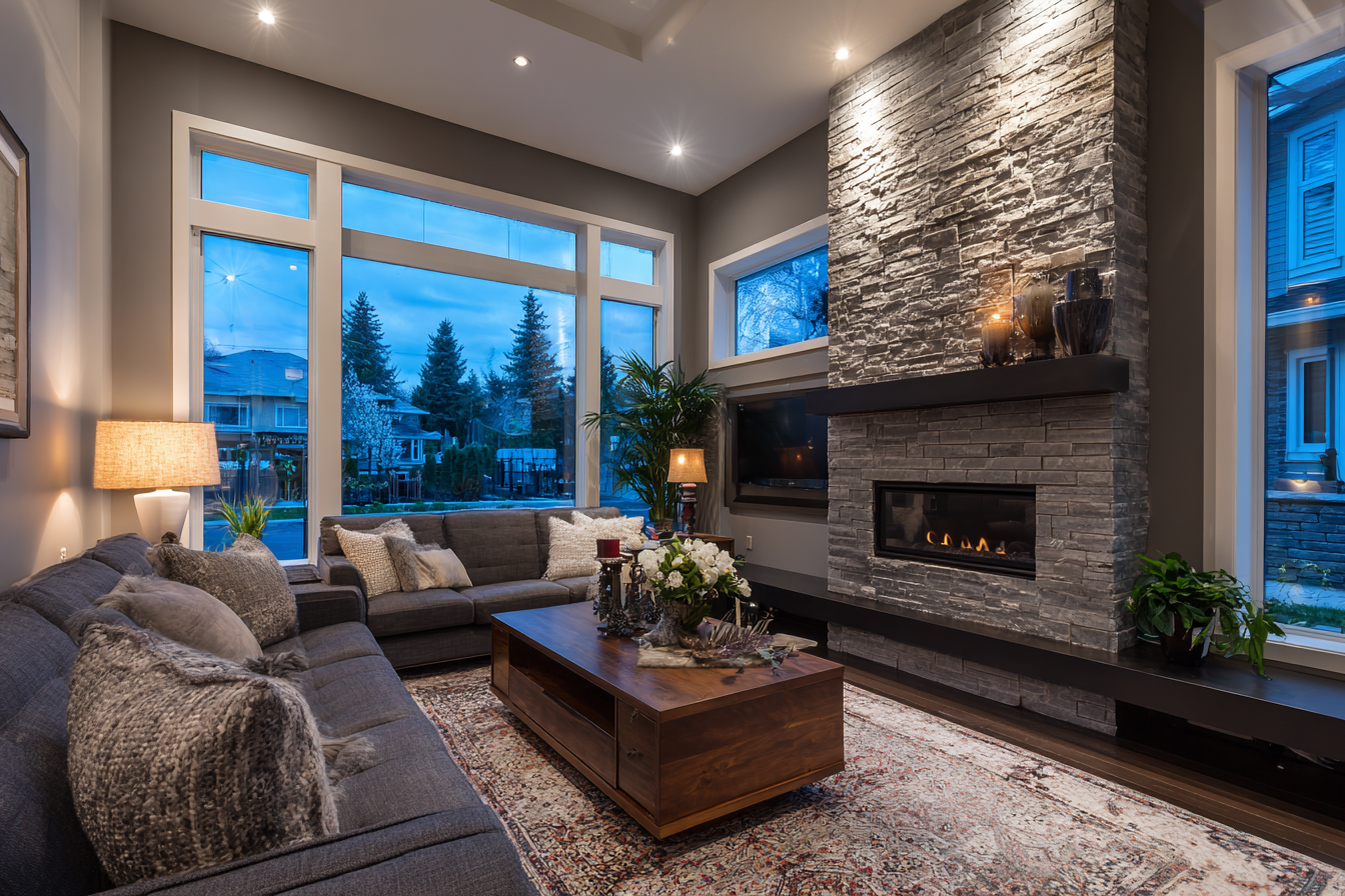
The Pro Move: Before you blame the paint, check your bulbs. If your grey walls look purple at night, your lightbulbs might be too cool. If your crisp white walls look dingy yellow at night, your bulbs might be too warm (2700K). Aim for 3000K LEDs for the most accurate colour representation.
How to Test Paint Like a Designer
This is the most important advice we can give you: Do not always trust the paint chip in the store.
Our stores are lit with different lighting than you would normally use at home. The chip will look different in a store than it does on your wall.
Also, do not paint a tiny 6-inch square in the middle of your wall.
When you do this, you are looking at the new colour surrounded by your old colour. Your eye will "compare" the two. If you are painting a grey swatch over a yellow wall, the grey will look purple because your brain is trying to compensate for the yellow.
The Cloverdale "Board Test" Method:
- Buy a Colour Tester: Pick up a small sample can of the colour you are considering.
- Get a Board: Buy a piece of white poster board or foam core (crafts or dollar store style).
- Paint the Board: Paint the entire board, edge to edge. Do two coats. Let it dry.
- Move it Around:
- Place the board in your North-facing room. Look at it in the morning.
- Look at it at noon.
- Look at it at night with the lamps on.
- Move it to a dark corner. Move it next to the window.
This allows you to see the colour in isolation, without the distraction of your old wall colour. It also lets you see how the "Northern Light" changes the colour throughout the day. You might find that the "perfect beige" turns greenish at 4 PM. Better to know that before you paint four walls!
The Cloverdale Difference – Why "Factory Direct" Matters
Cloverdale Paint is a family-owned Canadian company. Our chemists and colour experts work in Surrey, British Columbia, and produce paint at facilities across the country.
Because we are Factory Direct, the people you talk to in our stores are specialists. They aren't working in the plumbing aisle one hour and the paint aisle the next. They know our colour palette intimately. If you walk in and say, "My living room faces North, and everything looks blue," they know exactly which warm-undertone neutrals to pull for you.
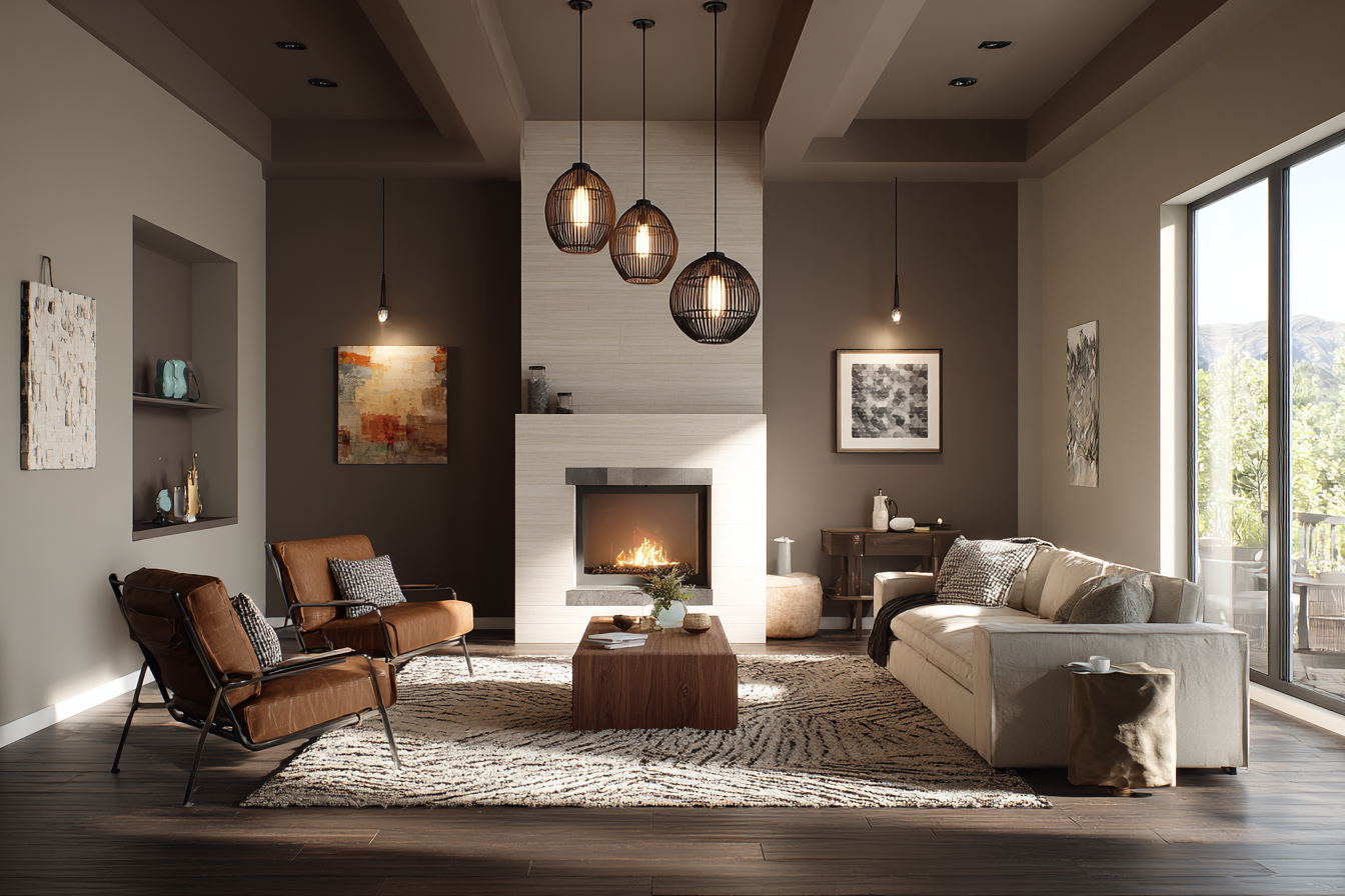
Conclusion: Embrace the Grey (But Paint it Warm)
Living in Canada means embracing the seasons. We have snowy winters, rainy springs, and glorious, bright summers. Your home needs to feel like a sanctuary through all of them.
Don't be afraid of the Northern Light. You don't need to fight it; you just need to balance it.
- Step away from the cool, stark greys.
- Lean into the warm "Greiges," the creamy off-whites, and the rich, earthy tones.
- Test your colours on a board, not just a swatch.
- Check your lightbulbs.
Your home is your biggest investment, and paint is the most affordable way to transform how it feels. A fresh coat of the right colour can make a dark February evening feel cozy and safe, rather than gloomy and cold.
Ready to find your perfect shade?
Stop guessing and start testing. Visit your local Cloverdale Paint store this week. Bring in photos of your room, tell us which way your windows face, and let our experts help you find the colour that turns your Northern home into a warm retreat.
Find Your Nearest Cloverdale Paint Store
Historical Note
In 1933, when Cloverdale Paint was founded, farmhouses in the Fraser Valley needed paint that could survive rain, mud, and sun. Today, while our homes have changed, the environment hasn't. We are still making paint for that same environment. That’s the Cloverdale Paint promise.